Pulse is a modern, component-driven Drupal theme built for the Pulse Site Template (Drupal Recipe). It extends Drupal's Stable9 base theme and provides a comprehensive design system with 29 ready-to-use Single Directory Components (SDC) organized using Atomic Design principles.
Key Features
-
Atomic Design Component Library — Includes:
- 7 atoms: Button, Heading, Icon, Image, Input Submit, Link, Text
- 13 molecules: Accordion Item, Breadcrumb, Contact Card, Content Detail, Dark BG Image Card, Image Card, Logo Section, Pagination, Section Heading, Stats KPI, Testimony Card, User Card, Video Card
- 9 organisms: Accordion, CTA Banner, Detail Page Hero Banner, Footer, Header, Hero Banner Style 02, Hero Banner with Media, Slider, Video Banner
- Canvas (Experience Builder) Compatible — All components are registered as SDC and work seamlessly with Drupal's Canvas/Experience Builder module, enabling drag-and-drop page building with pre-configured page regions such as Header, Footer, Primary Menu, Secondary Menu, Breadcrumb, and Highlighted.
-
Brand Customization via Theme Settings — Offers a full brand color palette including primary, secondary, neutral, heading, border, gray, success, danger, warning, and info colors, with automatic dark/light variant generation. Also includes:
- 10 configurable background colors
- Base font size control
- Font family selection (Geist, Sans-serif, Serif)
All settings are manageable through the Drupal admin UI without touching code.
-
Tailwind CSS v4 — Styled using PostCSS with Tailwind CSS v4 for utility-first, modern CSS authoring. Includes a build pipeline with
npm run buildand watch mode withnpm run watchfor development. -
Responsive Breakpoints — Ships with three breakpoints:
- Small: 0–639px
- Medium: 640–1023px
- Large: 1024px+
Also includes 1x and 2x multiplier support for responsive images.
- Phosphor Icons — Integrates the Phosphor icon family via Drupal's Icon API with configurable size, color, and accessibility alt text.
- Storybook Support — Includes Storybook configuration for isolated component development and documentation (work in progress).
-
CSS Custom Properties — All brand colors and typography settings are injected as CSS custom properties (
:rootvariables), making it easy to extend or override styles.
Designed for the Pulse Site Template
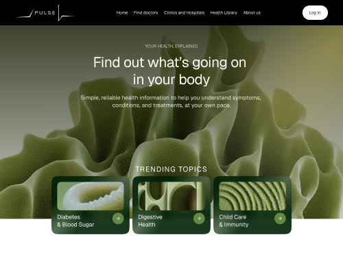
Pulse is the default theme for the Pulse Site Template, a Drupal Recipe that provides a complete site-building starter kit. When you install the Pulse recipe, this theme is automatically configured with pre-built Canvas pages, content templates (Article, Research, Video), view displays, and page region layouts — giving you a fully designed, production-ready site out of the box.
Requirements
- Drupal 10 or 11
- Node.js v20.11.0+
- Canvas (Experience Builder) module (recommended)
